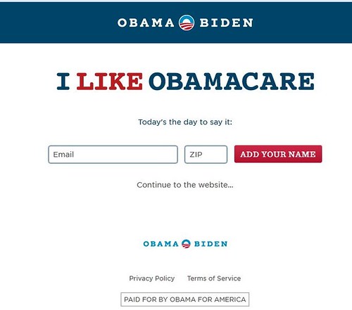
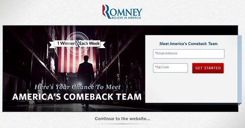
Democrats Barack Obama and Joe Biden are really rubbing ObamaCare in the faces of those who support universal, single-payer health care in their splash screen while Republican presidential candidate Mitt Romney's offers an interesting photo.
But Barack and Joe can take comfort in the fact that they don't have the worst splash. That 'honor' goes to Libertarian presidential candidate Gary Johnson.
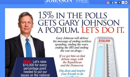
You'll note the text never ends and continues beyond the square we're providing. You can have the full screen to see the splash and still not see it all. That's your first clue that you're too cluttered for a website let alone a splash which is supposed to brief and clean.
While Johnson fails the splash, he doesn't fail the online office.
Who fails the online office the most?
SEP (Socialist Equality Party) presidential candidate Jerry White. Why does he fail?
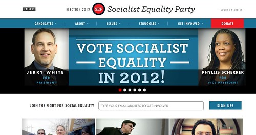
He doesn't even have a campaign website. He's using the Socialist Equality Party's website. Which reminds us a little of The Simpsons' episode "Marge vs. Singles, Seniors, Childless Couples and Teens and Gays" where Homer explains their campaign site, "For more information, visit our website, www.aljazeera.com, we're not affiliated, we're just piggy-backing on their message boards."
With Jerry White setting the bar so very low, you might think the others can claim success. They may try but two of them have no bragging rights.
It's a tough choice for who, with their own campaign office, is the worst?
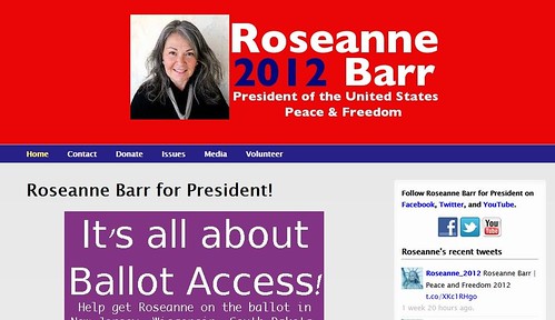
We're going to go with independent presidential candidate Roseanne Barr. We choose her because she has chosen a running mate. We have nothing against her running mate Cindy Sheehan but it's really sad that we have to go to Cindy Sheehan's Soapbox to discover Cindy's Roseanne's running mate. That's because there's nothing at Roseanne's site that informs you of that news.
You'll find the press release at Cindy's site. It was written, it's been e-mailed to people. But they 'forgot' to put it up at the campaign site.
The one that may be the worst but we're ranking it just a tad higher than Roseanne's? Green Party presidential candidate Jill Stein's website.

It's a little fancier than Roseanne's and has a little more information up. For example, while Roseanne's has no new information up from last week, Stein can point to three things her campaign posted last week.
None of the content is interesting, not in presentation, not in style, and it doesn't pull you in so it's probably only going to be seen by die-hards who already support Stein's run.
Here's some tough love for Jill Stein's campaign: It's over unless you take serious steps right now.
Your campaign is over if you don't immediately get your act together. True story, when there was little going on, the press was willing to cover Dennis Kucinich in 2007. But they went to his website and found nothing. A whole week had gone by and nothing had been posted. We know about it because we heard it from three different reporters. We heard about how Kucinich whines that no one covers his presidential campaign but when they were ready to shine a light -- mainly because there was nothing going on that week in the other campaigns -- Kucinich wasn't ready.
You never know when the press is finally going to come looking if you're not one of the two major candidates. You have to be prepared. You have to treat every day like this is the one the press decides to check you out.
Due to the Green Party's national convention in Baltimore earlier this month and the press interest in Roseanne (who had run for the party's presidential nomination), there was actually press interest in Jill Stein's campaign.
She failed to capitalize on it.
She's now a press joke based on an informal survey we did of seven outlets (two networks and five papers). She's a press joke because she's running as a Green?
No, she's a press joke because her campaign can't gets its damn act together.
She went on and on at the national convention in her speech.
Weeks later, that speech is still not up at her campaign site.
That speech explained why she was running and what she would do if elected.
Video of it and text of it should have been posted the day after the convention. It is now weeks after the convention and Jill Stein's campaign is a joke.
It had press attention, it had enthusiasm. In the two weeks since the convention ended, her campaign has killed off all of that.
If she wants to change that, she's going to need to upgrade her online office. That means she needs new content Monday through Friday -- at least one bit of new content, clearly linked to on the front page, each day. She needs a campaign blogger as well.
If she doesn't add those two things, you probably shouldn't donate to her campaign because it's money wasted. She's not going to get press attention because she's created the impression that she's not really running.
Roseanne Barr has less new content. But Roseanne's doesn't have Jill Stein's problems. First off, Roseanne is Roseanne which always means she'll have more luck at press. Second, she's independent. Her campaign needs to be posting content but she doesn't have a party behind her. Jill Stein does. That with a party behind her, she's not able to have a real campaign online is ridiculous and makes it appear that this is another election cycle where the Greens don't really want to win, aren't even trying to get ballot access for the 2016 cycle but just want to be sure they don't earn votes that someone might falsely accuse them of "stealing."
Jill Stein's campaign is seen as a joke.
For those who whine, "That's so unfair to Jill!," politics are unfair. Grow up. That's how she's seen and we've explained how she can change that.
How you can change it is one of the reasons we're doing this article now. In 2008, we offered "Rating the presidential campaign offices" and waited until after the election for that piece. This time, it's still July and people have time to make improvements. And Jill Stein needs to do so or she can pack it in right now. If she can't get her online office together, she needs to drop out because she's wasting everyone's time and the press considers her a joke.
She's brought it on herself. Not since 2000 has a Green Party presidential candidate gotten so much press as she did the week of the convention. And she took that interest and . . . did nothing with it.
We're left with three campaigns: Gary Johnson, Barack Obama and Mitt Romney.
The worst of those three? Let's go by visual.
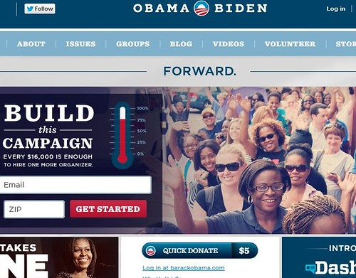
Barack Obama's. We're not really fond of photo shop and the look of Barack's campaign site is that of someone who just discovered photo shop and can't stop using the "vintage" effect on every photo they have.
Would it be possible for Barack's team to allow even one photo to appear in focus?
Maybe that's supposed to be a commentary on how blurry and washed out his own vision is?
Doesn't seem like a selling point but who knows what the Cult of St. Barack is snorting these days.
In terms of content, the office is always open and always has something new. Content is first-rate and the staff deserves huge applause. We do question the posting of the Weekly Address at a campaign site, but otherwise, we praise the content.
If visuals drop Barack to number three of the top three, who comes in second?
Gary Johnson.
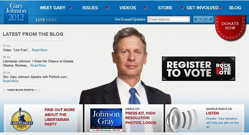
Sorry, Gary, but in America we like happy people.
On his splash screen and on his main webpage Johnson uses the same photo and he's not smiling in it. We like politicians who smile and smile broadly. We're not voting for the Mona Lisa to be president so lose the half smile. A smile means your lips go up at the sides and you show your teeth.
Failing to provide that doesn't make you look serious when it happens in two pictures in a row, it makes it look like you have a stick up your ass.
On presentation, Johnson does a much better job. First off, you know there's content without scrolling. You can see the first item at the bottom of the screen. Second, new content goes up Monday through Friday. This is no Jill Stein office where it appears everyone's either making a run to their local pot dealer or off shopping for a new Bheka yoga mat.
The clear winner?
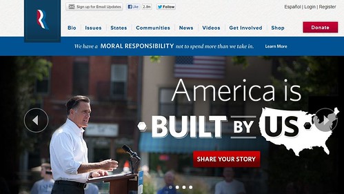
Mitt Romney. The visuals are crisp. The photos are clear and don't leave you rubbing your eyes and wondering if you need to get new contacts. The presentation is also first-rate with plenty of new content. It's also the only site whose navigation we'd praise. You can use pull down menus, you can search, you can click, all with ease, and find what you need quickly.
So the ranking, from best to worst:
1) Mitt Romney
2) Gary Johnson
3) Barack Obama
4) Jill Stein
5) Jerry White
We'll revisit this topic before the election. Hopefully, everyone will have improved their sites by then. As we observed in 2008, this is your online office. It is open 24 hours, 7 days a week. People can visit it at any time. You need to grasp that and you need to provide them a reason to visit you again.
--------------
Technically Barack Obama is not the Democratic Party nominee and Mitt Romney is not the GOP nominee. That's because their party conventions have not been held yet. We're not in the mood to use "presumptive." If there's an upset later on, we'll note in a new feature.
