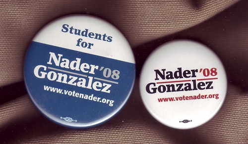
Ralph Nader will appear on MSNBC on Sunday, November 9th, from 11:15 to 11:30 EST.
Please tune in to hear Ralph's thougths on the 2008 presidental election and what his next steps will be moving into 2009.
Onward!
The Nader Team
That e-mail hit inboxes Saturday afternoon and along with offering a heads up, it gives us an opportunity to comment on some of the independent and third party presidential campaigns as well as on the Republican and Democratic presidential candidates. The top of the tickets on the candidates we're going to focus were Ralph Nader, Bob Barr, Chuck Baldwin and Cynthia McKinney.
During the lead up to the Democratic primaries (in 2007) we made a comment that needs to be repeated here: Your website is your online office.
That means it needs to be opened 24 hours a day, seven days a week.
That's even more true with regards to independent and third party presidential candidates because there are many areas of the country where they may not be able to open a physical office.
Best online office:
The Ralph Nader - Matt Gonzalez ticket.
Their website started off strong and would have been just fine if it had remained the same but instead they retooled it to give it a different look. They also never stopped thinking of ways to draw attention and to provide new content. It was easy to navigate and provided a variety of mediums: audio, video and text.
Worst online office:
The Chuck Baldwin - Darrell Castle ticket.
Was the election in September? No. Then why did they stop posting new content then? And when October posting finally started, why did it result in so few postings? The Constitution Party is a conservative party and apparently they were trying to 'conserve' the chances that anyone would learn of their ticket.
In the middle?
Bob Barr's was professional but updated too infrequently. Cynthia McKinney's started out an eye-sore (as noted online in plenty of places outside this community) and was retooled. It was a successful makover appearance wise. It could have used more content and it could have used linkable posts for new items.
Over before the election was?
Not just Chuck Baldwin. Mid-way through the last week of October, the Cynthia McKinney - Rosa Clemente ticket's website was down and did not come back up before election day. (It was back up the day after the election.)
Freedom of Speech Award?
The John McCain - Sarah Palin ticket's website. Unlike at the Barack Obama - Joe Biden website, you could disagree with McCain and/or Palin. You could disagree, you could say there was no way you would vote for them. You weren't censored for that. Your comment didn't quickly disappear. Every post on the campaign's blog allowed for comments and it was a rare post that didn't find several people weighing in that they didn't care for McCain or Palin or both.
Online Team?
Matt Lira at McCain - Palin busted his ass and deserves special attention, he's not the only one. Nader - Gonzalez' Jason Kafoury, Ashley Sanders and Loralynne Krobetzky made their presence felt online. Yeah, Barack had a blogger as well. Surprisingly, he didn't impress us one bit.
Swag?

Nader - Gonzalez won hands down. McCain - Palin offered none because they didn't raise funds. McKinney - Clemente were raising funds but did not have an online store for their merchandise. (You were referred to a third party vendor if you attempted to navigate their site in search of t-shirts, buttons, etc.) Nader - Gonzalez offered as many items as did the three front runners in the Democratic Party primary (Clinton, Edwards and Obama). Looking for a t-shirt? A ball cap? A sticker? A button? A mug? Whatever you were looking for, chances were you could find it at the campaign's online store and, unlike the Barack - Biden, you weren't required to sign over your first born.
Message?
Everyone runs for a reason. Can a person click on your site and immediately tell why you're running? In alphabetical order.
Chuck Baldwin? Not only was the message unclear to a casual visitor, it wasn't even clear they were running for office, let alone that Baldwin and Castle were running for the White House. "Let the truth be heard!" proclaimed the website and you'd have to click on some links to find out what 'truth' that was -- provided you didn't mistake it for some sort of conspiracy website. Baldwin's site stands out as the only campaign site whose homepage did not note what office the candidate was running for at the top of the page. Grade: C-minus.
Bob Barr? Did Bob and Chuck have the same photographer? They're certainly posed the same way; however, whomever cropped Chuck's photo did a better job making Chuck appear closer while Bob appears to shrink. Grade: C-plus.
John McCain? Best top of the page for everyone of their webpages. A photo of McCain and Palin and their logo. On every webpage during the campaign. Web fault? Despite complaints from bloggers that the display of campaign photos (slideshow) was not allowing for easy reposting, the campaign waited until last week to fix that. Grade: A.
Cynthia McKinney? After a really bad start online, her campaign site improved immensely and there was never any doubt that she was running an issues based campaign. The top item was almost always a hard hitting take on issues such as the death penalty, prison, the bailout, you name it. Grade: B.
Ralph Nader? If each page had featured Nader and Gonzalez' faces, it could have had an A. That was their only shortcoming. Yes, it's redundant but it's also effective. Grade: A-minus.
Barack Obama? Were Barack and Joe supposed to be starring in a same-sex remake of Lost Horizons? Or was the site promoting Georgia O'Keeffe knock-offs? Who knows, all this time later, who knows? Grade: C.
